Now that I've thought about the masthead font and some ideas, I realized I also needed to think about colors and their visual appeal. I certainly want to make it colorful and bright, but not to the point of it being garish.
The colors yellow and red can increase appetite in the viewer, and are also widely used in comic books which matches my theme, so I could use those as my main colors in my masthead ad potentially my cover page. I used a color palette generator to get some visually appealing color combinations and these were my favorites:
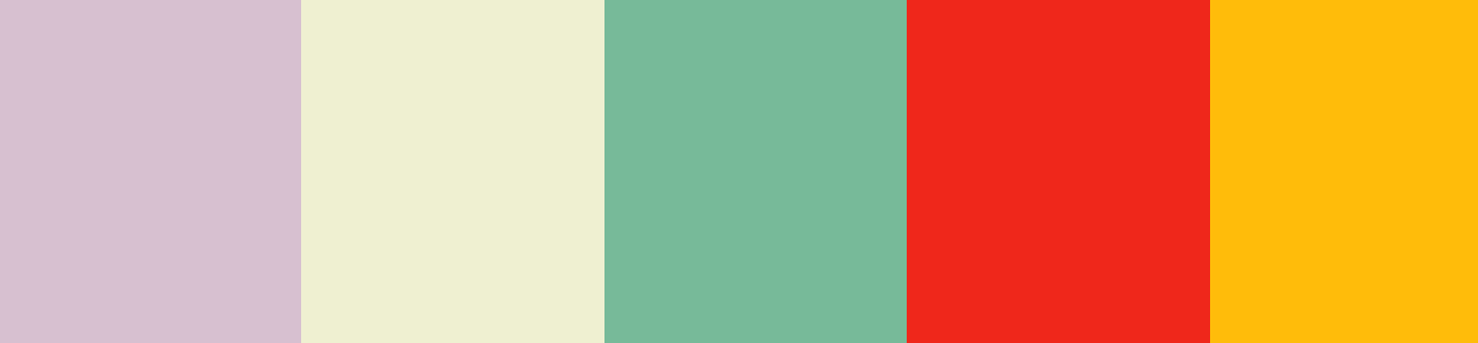
These all have a brighter red and yellow that would pop out more and while the other colors are more subdued they fit and are still really nice to look at, matching that comic book style pretty well.
Wednesday, March 13, 2019
Subscribe to:
Post Comments (Atom)
Here's my CCR Reflection! https://drive.google.com/file/d/1UDDhkvDgUGgk6A9gmYLy1a31GoLiBGEZ/view?usp=drivesdk
-
To make my masthead original, I figured I'd make it from scratch from the sketch I posted earlier. I used the Microsoft Autodesk app an...
-
Bake day part deux! I'm back with the update on the final bakes! Sara came over again today and this helped me finish up the whole th...
-
Since I do not have any images to work on my two page spread, I've decided to at least start working on the layout and formatting of my ...
No comments:
Post a Comment