Here's my CCR Reflection!
https://drive.google.com/file/d/1UDDhkvDgUGgk6A9gmYLy1a31GoLiBGEZ/view?usp=drivesdk
Thursday, April 4, 2019

Reflection:
Fan Foods was based around the idea of making
a food magazine based on pop culture, with articles about making food items
inspired by or that had appeared in certain shows or movies. This was already a
huge passion of mine as I love attempting to recreate iconic Disney recipes or
making cookies decorated with superhero symbols, and this is a magazine I wish could have existed when I was starting out. Considering the strong pop
culture base my audience would be the people most connected to digital media,
so it would be teenagers and young adults. Due to that audience I had to keep
in mind that most of my audience would not be experts in terms of cooking
skills. It was apparent from the start
that I was going to be changing things up in terms of magazine conventions.
Most food magazines are made for middle aged or older women, and focus on a fancier approach, allowing its readers to feel like they can create beautiful restaurant style meals at home. The color scheme is lighter, with colors like white, gold, soft grays or silver. My magazine, on the other hand, uses bright, comic style colors that really pop out and make it attractive to its target audience. It also doesn’t focus on making difficult, perfect meals, focusing on simpler yet fun recipes that don’t have to turn out perfect. I suppose the group that I am representing with this is the teens that are going to be reading this magazine. I suppose I’m representing them as people who do want to learn useful yet fun skills like cooking. There’s a strong stereotype that those of younger generations no longer want to learn these skills and would rather be lazy and have things done for them and only eat fast food and such things. This is the social aspect that I really want to combat, as I think a lot of teens and young adults would really be interested in learning how to cook if they had the chance. That relates to how my product engages with the audience, as the subject matter of pop culture and the eye-popping colors really serve to attract my audience to read the magazine. The cover lines in the magazine are formatted almost like social media articles are, in the style of “Top ten things” This is the same that we can see in my table of contents, as usually they have small descriptions of the article near them, but my magazine makes the titles clear and to the point, so it appeals to an audience that, because of the rise of social media, is used to things being quick and to the point without having to read summaries. If this project were to be distributed, I would really play to the pop culture aspect of the magazine and would reach out to large media companies to maybe write about the food in their newest series or film, so that the magazine can be marketed alongside it. I would distribute it as an online magazine, as teens and young adults are far more connected to things online.
As far as how my production skills developed throughout this project I would say I learned a lot more about photo lighting and the design of the background of the photo to make it look more appealing as I did not realize the extent to which lighting makes the photo quality soar. I also learned a lot about graphic design and color, as at first it was a little hard to make sure the colors pop enough to give that comic look I was searching for, but not enough that it starts hurting people’s eyes to look at. Unfortunately, I also made a pretty big mistake, which was taking the photos with the wrong tool.I mostly used my mom's new phone which has the highest camera quality and made the pictures turn out perfect, but when she got a call I used another phone for the full image for the two page spread, and that one did not have a high enough quality to enlarge the image like I planned to.That meant I had to think on my feet a bit more and change my original plans. Still I think I like this version a lot more than my original plan, as it feels like it pops out a lot more and reminds me of those Seventeen magazines that were some of my first sources of inspiration,
I used all kinds of technology to bring this project to light. Joomag was a fantastic website to use for the whole thing, as its layer feature allowed me to add all of the pictures on the table of contents as the comic panels you see here by letting me put the yellow text squares above the image and frame it all in a nice border. I found an iPhone app that increased the saturation of an image to give it a comic effect, and use that to make some of my duller images really pop. I got the comic text box icons from Microsoft Word and they were a great way to place my text in for the two page spread. This graphic design helped me find new ways to do things with the software I already had. Overall I learned so much from this entire experience, had a blast creating it with a friend, and am really excited about how it came out.
Most food magazines are made for middle aged or older women, and focus on a fancier approach, allowing its readers to feel like they can create beautiful restaurant style meals at home. The color scheme is lighter, with colors like white, gold, soft grays or silver. My magazine, on the other hand, uses bright, comic style colors that really pop out and make it attractive to its target audience. It also doesn’t focus on making difficult, perfect meals, focusing on simpler yet fun recipes that don’t have to turn out perfect. I suppose the group that I am representing with this is the teens that are going to be reading this magazine. I suppose I’m representing them as people who do want to learn useful yet fun skills like cooking. There’s a strong stereotype that those of younger generations no longer want to learn these skills and would rather be lazy and have things done for them and only eat fast food and such things. This is the social aspect that I really want to combat, as I think a lot of teens and young adults would really be interested in learning how to cook if they had the chance. That relates to how my product engages with the audience, as the subject matter of pop culture and the eye-popping colors really serve to attract my audience to read the magazine. The cover lines in the magazine are formatted almost like social media articles are, in the style of “Top ten things” This is the same that we can see in my table of contents, as usually they have small descriptions of the article near them, but my magazine makes the titles clear and to the point, so it appeals to an audience that, because of the rise of social media, is used to things being quick and to the point without having to read summaries. If this project were to be distributed, I would really play to the pop culture aspect of the magazine and would reach out to large media companies to maybe write about the food in their newest series or film, so that the magazine can be marketed alongside it. I would distribute it as an online magazine, as teens and young adults are far more connected to things online.
As far as how my production skills developed throughout this project I would say I learned a lot more about photo lighting and the design of the background of the photo to make it look more appealing as I did not realize the extent to which lighting makes the photo quality soar. I also learned a lot about graphic design and color, as at first it was a little hard to make sure the colors pop enough to give that comic look I was searching for, but not enough that it starts hurting people’s eyes to look at. Unfortunately, I also made a pretty big mistake, which was taking the photos with the wrong tool.I mostly used my mom's new phone which has the highest camera quality and made the pictures turn out perfect, but when she got a call I used another phone for the full image for the two page spread, and that one did not have a high enough quality to enlarge the image like I planned to.That meant I had to think on my feet a bit more and change my original plans. Still I think I like this version a lot more than my original plan, as it feels like it pops out a lot more and reminds me of those Seventeen magazines that were some of my first sources of inspiration,
I used all kinds of technology to bring this project to light. Joomag was a fantastic website to use for the whole thing, as its layer feature allowed me to add all of the pictures on the table of contents as the comic panels you see here by letting me put the yellow text squares above the image and frame it all in a nice border. I found an iPhone app that increased the saturation of an image to give it a comic effect, and use that to make some of my duller images really pop. I got the comic text box icons from Microsoft Word and they were a great way to place my text in for the two page spread. This graphic design helped me find new ways to do things with the software I already had. Overall I learned so much from this entire experience, had a blast creating it with a friend, and am really excited about how it came out.
Tuesday, April 2, 2019
Wednesday, March 27, 2019
Bake day part deux!
I'm back with the update on the final bakes! Sara came over again today and this helped me finish up the whole thing (Can I mention how honestly amazing of a friend she is!! I had a lot of fun baking with her and I'm super grateful for all of her help)
Anyway the first thing we did was prepare the icing for the already made cookies, using a recipe my mom gave me, and then Sara showed off her drizzling skills once again by drizzling the icing to look like the stripes in the Harry Potter ties. Overall they were by no means perfect but I think that's what makes me love them even more.
Then we moved on to the butterbeer, which we did last in order for the whipped cream to come out as best as possible and topped with butterscotch chips.We also tried to accessorize it with some Harry Potter merchandise I had lying around.

We retouched the pizza bites by adding more sauce and more freshly melted cheese and then we were ready for group pictures!!!!!!!
 I'm absolutely in love with how everything turned out and it was pretty much exactly what I had thought it would be!


We retouched the pizza bites by adding more sauce and more freshly melted cheese and then we were ready for group pictures!!!!!!!

Tuesday, March 26, 2019
Bake day!
Today was our bake day, and unfortunately my friend Kira couldn't make it so it was just Sara and me. The plan originally was to have my parents go get the ingredients early so I could have everything mostly measured out and prepared by the time Sara arrived but due to unforeseen delays I wasn't able to do that since my parents came home right before she arrived around late afternoon ish. Still we made the best of the time we had and got baking.
The fries came out beautifully!!!! We topped them with salt and pepper and took photos of them in a large bowl (I even used a trick by padding the bowl with paper towels to make it look fuller and make the fries pop out more)

This was one of my favorite pictures of it!
Then we moved on to the pizza bites, and I made a small mistake then by actually attempting to roll out and knead the puff pastry, rather than just cutting it out of the already rolled out dough, luckily we had two sheets. Second time's the charm I guess!


After that we moved on to the popcorn, in which Sara showcased her amazing drizzling skills and also had a joking idea that I ended up adding to the recipe. I had some Lilo and Stitch chocolate molds that she thought would be fun to use and so we ended up ditching the chocolate drizzle and just added little chocolates on top of the caramel (or in this case butterscotch) corn, making it more of a snack mix instead. The chocolates didn't turn out perfect but they were definitely cute and fun!
We made the dough for the cookies then, but we realized it was getting kinda late and Sara had to head home. Luckily she was already coming over tomorrow and said she'd love to help continue this so we'll have to finish the group photos then. I'm posting this pretty late so I should probably head to bed but will be back with an update tomorrow!
Friday, March 22, 2019
While working out the layout of my two page spread before I take my images, I remembered a magazine I saw while working on an activity in class. It was a thanksgiving magazine and I think it gave me a good idea of what exactly I want my two page spread to be like.


Having a large image of the whole layout first Andrei then having another two page spread for each food item puts a lot more work on my plate but it allows me to focus on each item and their own recipe and have a really nice full image of the whole thing as well I like the idea of also giving little tips on the specific food item and how best to prepare it, which I will most likely do on the individual sections.


Also there's fun news! My friends Kira and Sara are going to help me with the making of the items and the photo taking next Tuesday, so we'll all get to have fun and hang out while doing so!
Thursday, March 21, 2019
Since I do not have any images to work on my two page spread, I've decided to at least start working on the layout and formatting of my table of contents. I decided that for it I really want to do a nice comic book style so I looked up a couple of images like this for reference.
 I really liked the yellow boxed text so I figured I'd use something similar to that and then put my different articles in boxes mug like the comic panels above. I had some images of other foods I'd already done beforehand that were well taken so I figured why not use some of those to start making it and laying it out. This is what my first page looks like so far without some of the images that I don't have yet.


The reason some don't have titles yet is because it's been a bit difficult to think of titles without seeming really repetitive. Also I just now realized that I forgot about the page numbers but I'm going to add them inside the image. I'm unsure if I should make space for a small description of the article as I've seen good magazines do because I fear it might make it seem way too cluttered, but overall I really like the look of this page and I feel like it came out exactly how I wanted it.
The two page spread I have planned is something along the lines of "The best snacks for a great watch party". It's going to contain a couple of recipes but they will all be fairly simple and easy to pull off for anyone. I've looked up some recipes for what I want to do, and I've kind of modified them to either make them simpler or use less ingredients so I don't have to buy as much to make them.
1. The first item I thought of was fries and I found this recipe, which allows you to make them without frying with oil by using an air fryer, which is a lot less complicated.
2. The second item I thought of was pizza bites, and instead of having to prepare the dough I thought I'd find a recipe that uses puff pastry, which you can get already made. This recipe was what I decided I'll do.
3. The third item was caramel corn, and for this one I've decided not to use a recipe as I saw that most were made by heating up sugar and that's a lot more complicated than I want, so I've decided to just make popcorn and cover it with melted chocolate and butterscotch.
4. The fourth item was a drink, and for this case, I've chosen on of the most iconic drinks which is Harry Potter Butterbeer. In this case I'm also not going to use a recipe as from all of the ones I looked at, they used too many things including heavy cream when it really wasn't necessary. My version is going to be cream soda mixed with melted butterscotch chips and ice cream mixed in (plus whipped cream for decoration.
5. The fifth item is going to be sugar cookies, and since I've done an item themed on Harry Potter, I figure I'll decorate those in the colors of the Hogwarts houses. I'll be using my mom's recipe for those since it's absolutely delicious. I plan on baking everything during my spring break because I'll have a bunch of time and am not going anywhere.
I'm pretty excited to make all of this! It'll be pretty fun to try out these recipes!

1. The first item I thought of was fries and I found this recipe, which allows you to make them without frying with oil by using an air fryer, which is a lot less complicated.
2. The second item I thought of was pizza bites, and instead of having to prepare the dough I thought I'd find a recipe that uses puff pastry, which you can get already made. This recipe was what I decided I'll do.
3. The third item was caramel corn, and for this one I've decided not to use a recipe as I saw that most were made by heating up sugar and that's a lot more complicated than I want, so I've decided to just make popcorn and cover it with melted chocolate and butterscotch.
4. The fourth item was a drink, and for this case, I've chosen on of the most iconic drinks which is Harry Potter Butterbeer. In this case I'm also not going to use a recipe as from all of the ones I looked at, they used too many things including heavy cream when it really wasn't necessary. My version is going to be cream soda mixed with melted butterscotch chips and ice cream mixed in (plus whipped cream for decoration.
5. The fifth item is going to be sugar cookies, and since I've done an item themed on Harry Potter, I figure I'll decorate those in the colors of the Hogwarts houses. I'll be using my mom's recipe for those since it's absolutely delicious. I plan on baking everything during my spring break because I'll have a bunch of time and am not going anywhere.
I'm pretty excited to make all of this! It'll be pretty fun to try out these recipes!
Wednesday, March 20, 2019
To make my masthead original, I figured I'd make it from scratch from the sketch I posted earlier. I used the Microsoft Autodesk app and a stylus pen to trace over my original design with the color palette I chose.
 The only thing that worries me about it is my fear that it'll look kind of unprofessional. I tried my best to make it as neat looking as possible but I might not use it if I find it looks too strange. The peer review we are doing next week is probably really going to help me with that. I'm using Joomag to create my magazine, so I had to remove the background from my logo and place it there. I used an app I found on my phone called Background Eraser and luckily it didn't lower the image quality.


Seeing these two options side by side I definitely prefer it on the side and tilted like it is in the first image, it seems a lot closer to that comic book style that I'm going for with the entire magazine.
Thursday, March 14, 2019
I've found another YouTube channel that has given me some idea inspirations. It's called Rosanna Pansino, and the creator has a series called Nerdy Nummies and focuses on recipes inspired by popular shows, movies, and other forms of media. Her recipes can sometimes be simple, but a lot of them can also tend to be complicated. A thing I enjoy about her tutorials is how she always encourages her audience to have fun and customize the recipe im fun ways that they like. This has given me the idea to possibly do a recipe based on something with multiple variations, for example: Hogwarts houses, where depending on which one you have you could customize the recipe to be a different house theme. I also think the different house crests are very stylish and have fun eye popping colors that could certainly give a nice aesthetic.


Wednesday, March 13, 2019
Now that I've thought about the masthead font and some ideas, I realized I also needed to think about colors and their visual appeal. I certainly want to make it colorful and bright, but not to the point of it being garish.
The colors yellow and red can increase appetite in the viewer, and are also widely used in comic books which matches my theme, so I could use those as my main colors in my masthead ad potentially my cover page. I used a color palette generator to get some visually appealing color combinations and these were my favorites:
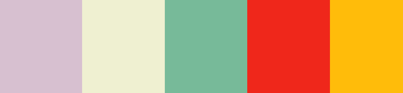


These all have a brighter red and yellow that would pop out more and while the other colors are more subdued they fit and are still really nice to look at, matching that comic book style pretty well.
The colors yellow and red can increase appetite in the viewer, and are also widely used in comic books which matches my theme, so I could use those as my main colors in my masthead ad potentially my cover page. I used a color palette generator to get some visually appealing color combinations and these were my favorites:
These all have a brighter red and yellow that would pop out more and while the other colors are more subdued they fit and are still really nice to look at, matching that comic book style pretty well.
Thursday, March 7, 2019
Here are some sketches of what some of my title font ideas are:
 This one is in a more comic book style and I think it really pops. The border also really makes it exciting and appealing to the audience.
 This one i think is my least favorite. I tried to go for a 3D more geometric style look but I don't think it would be the best.
 This is a more bubble letter style and I like how its more simplistic and still kinda bouncy, fun and laid back.


Title font ideas:
Since my magazine is going to be for a young audience and is going to be based off of pop culture and media, I think it'll be best if I make my font be fun and colorful. The first idea that I have is to make it in a sort of comic book text style and these were some examples I saw that could fit what I'm trying to go for:
Wednesday, March 6, 2019
Masthead thoughts:
I'm having a bit of a dilemma, as I wanted to start looking for some different font ideas and ways to format my masthead and cover page, but I can't seem to think of any titles that I could give my magazine. I want it to sound fun and inviting, to attract new readers to try out cooking and check out the recipes inside.I tried looking at some examples for inspiration like, Bon Appetit, Taste, Tasty, Delicious Dishes, and Good Food. It seems like most are very to the point and simple but I think I just keep overthinking mine. I need to just state what the magazine is like front and center i guess.
Welp, something really funny just happened. Just as I was typing this out I came up with a title. I think I actually really like it.
My masthead is gonna be Fan Foods!
I'm glad I came up with it cause now i can start brainstorming some style aspects and how it will look which is going to be a lot of fun!
Thursday, February 28, 2019
Small Subversion of classic conventions:
Since my audience is very different from the typical audience of a food magazine,which tends to be middle age to older women, I'm probably going to have to make a lot of changes in the style. Due to its typical audience, food and recipe magazines tend to be very stylized and elegant, appealing to those that want their food to look delicate and beautiful while tasting delicious and homemade. The fonts are usually nice cursive fonts and there are usually some articles related to hosting events like dinners for holidays or family events. One good example of typical formatting would be thsi magazine from Food Network:
It contains hosting ideas like appetizers and is very stylized with its cursive font. Looking at the table of contents here, it definitely also has a lot of recipes for a more experienced reader to follow, like brioche bread. I'm hoping to make mine easy to follow for younger people that may be starting out, with far simpler recipes.
I definitely don't want to have my magazine have the same look as typical food magazines so I decided to look at some magazines that are more for the people in my target audience. Upon my first search I saw a bunch of copies of Seventeen magazine:
 While
this magazine is a lot more fashion suited in audience I do think it
gives some good pointers towards formatting ideas, mainly making it more
vibrant, making the titles and the articles pop, using bright colors
and attractive text. These are ideas and forms of inspiration I'll
certainly take into account when creating my magazine in hopes of making
it appealing and fun to read.
While
this magazine is a lot more fashion suited in audience I do think it
gives some good pointers towards formatting ideas, mainly making it more
vibrant, making the titles and the articles pop, using bright colors
and attractive text. These are ideas and forms of inspiration I'll
certainly take into account when creating my magazine in hopes of making
it appealing and fun to read. Wednesday, February 27, 2019
I think I've decided I might do a mix of my two ideas since they do overlap and make my magazine issue have simple, regular recipes and also some that are themed to certain shows or movies.
While searching for more inspiration on food magazines or recipes more suited towards teens, I found this list of articles by Seventeen magazine that contained a bunch of easy recipes. An important thing I found here was the article about recipes to make in a dorm room, because dorm room adaptability is something I definitely want to look into for some of my recipes and ideas, so that they can appeal even to those that may not have as many kitchen tools or ingredients.
Doing further research on common dorm kitchens I found that most have a microwave or a small refrigerator so I might have to look for some recipes that can work with those appliances and test them out (which might be difficult considering I don't have a microwave at home). Then after that I could attempt to make them a lot more fun or based on different pop culture things. (The pop culture idea is something I'll have to narrow down since there's a huge variety of popular shows and movies to choose from.)
While searching for more inspiration on food magazines or recipes more suited towards teens, I found this list of articles by Seventeen magazine that contained a bunch of easy recipes. An important thing I found here was the article about recipes to make in a dorm room, because dorm room adaptability is something I definitely want to look into for some of my recipes and ideas, so that they can appeal even to those that may not have as many kitchen tools or ingredients.
Doing further research on common dorm kitchens I found that most have a microwave or a small refrigerator so I might have to look for some recipes that can work with those appliances and test them out (which might be difficult considering I don't have a microwave at home). Then after that I could attempt to make them a lot more fun or based on different pop culture things. (The pop culture idea is something I'll have to narrow down since there's a huge variety of popular shows and movies to choose from.)
Sunday, February 24, 2019
An update on the photography tricks I was talking about a couple of days ago: One of my friends has taken a couple photography classes and has offered to teach me some of the things he's learned so that I can take well lit and well positioned photos. The only thing he's asking in return is to try some of the food I will inevitably be making, and that's perfectly fine by me because otherwise I could end up eating it all and that would definitely not end well for my stomach.
In other news, I've been looking over some ideas for both of the magazine concepts I came up with and I've been trying to decide which option is best
For the film themed foods magazine concept I found this YouTube series that has been giving me inspiration for some foods I could put into my magazine. His videos are very in depth and are good at explaining some concepts that may be new to viewers that are not as experienced with cooking, something I definitely want to keep in mind for my audience.
For the basics of cooking magazine concept I began looking at this list of articles by The Spruce Eats that are all focused on the basics of cooking to see what different things I should explain that best fit my audience. Unlike their list which is focused on a more adult audience, I want to keep mine in mind by doing the recipes that use the simplest and most inexpensive equipment and ingredients, as my audience may be teens in college or who are preparing to go there and may not have a high budget for food, but still want to eat healthy and nice meals.
In other news, I've been looking over some ideas for both of the magazine concepts I came up with and I've been trying to decide which option is best
For the film themed foods magazine concept I found this YouTube series that has been giving me inspiration for some foods I could put into my magazine. His videos are very in depth and are good at explaining some concepts that may be new to viewers that are not as experienced with cooking, something I definitely want to keep in mind for my audience.
For the basics of cooking magazine concept I began looking at this list of articles by The Spruce Eats that are all focused on the basics of cooking to see what different things I should explain that best fit my audience. Unlike their list which is focused on a more adult audience, I want to keep mine in mind by doing the recipes that use the simplest and most inexpensive equipment and ingredients, as my audience may be teens in college or who are preparing to go there and may not have a high budget for food, but still want to eat healthy and nice meals.
Friday, February 22, 2019
Hey, I'm back on this blog and extremely ready and excited to do a lot more research and finish this project! I've decided on a food magazine because cooking is one of my favorite hobbies and I think that's the one I'll be able to pull off the best and also enjoy the most. As far as audiences go, my audience is going to be around the ages of 15-23, teens to young adults, people who may only just be starting to learn how to cook.
As for the actual content of the specific magazine I have two ideas:
As for the actual content of the specific magazine I have two ideas:
- An issue focused on teaching basics and concepts of cooking to those who may want to start learning simpler recipes, which works well with my young audience
- An issue focused on more fun, entertaining recipes based on things like popular films and tv shows that people can make for things like fan events and watch parties
Wednesday, December 5, 2018
Final Project Representation:
With
my final project I really want to represent cooking and people who
enjoy either cooking as a hobby or a career as creative artists, because
there are a lot of ways to cook and a lot of flavors to experiment
with. there's also a huge decorative and appealing aspects to food in
general. I think my audience will be a teenage or young adult audience
so I also want to make it easy for people who are not already into
cooking and desserts to find their passion in it. I want to show how fun
and relaxing the hobby of cooking could also be for those that are
looking for a fun way to try it out. I also want to show food as a
medium of expression just like paint or drawings and show how special it
can be to some.
Tuesday, December 4, 2018
Genre Research
Genre: Fitness Magazine
Genre conventions – content: Fitness magazines usually have a lot of articles that relate to
creating that perfect fitness lifestyle. This includes a lot of talking about different kinds of
workout routines and who and what they work best for, for example, exercises for kids to help
keep the whole family active, or exercises for middle aged or older people. It also includes talking
about dieting in a way to improve people's fitness routines, whether it is with protein bars or energy
increasing smoothies or drinks. It has some recipes that are suited towards different workout types.
Genre conventions – production techniques:
A lot of the production techniques for fitness magazines have to do with good photography. Action shots require good lighting, which is often replicated to look like an outdoor shot if it isn't one already. Sometimes in order to take photos of people in action the camera will just continuously take photos of a person as they perform a certain action. This is most likely when it is a picture of a sporting event. There also needs to be good images when giving food recipes. The food needs to be centered, as well as appealing to the eye in color. There also needs to be a lot of research towards the articles in order to provide people with accurate fitness information.
A lot of the production techniques for fitness magazines have to do with good photography. Action shots require good lighting, which is often replicated to look like an outdoor shot if it isn't one already. Sometimes in order to take photos of people in action the camera will just continuously take photos of a person as they perform a certain action. This is most likely when it is a picture of a sporting event. There also needs to be good images when giving food recipes. The food needs to be centered, as well as appealing to the eye in color. There also needs to be a lot of research towards the articles in order to provide people with accurate fitness information.
Institutional conventions – marketing:
A lot of the marketing has to with showing people images or numbers towards their indicated fitness
goals. For example, fitness magazines often have very appealing articles stating that a workout routine
help anyone lose weight in a day, or how a specific celebrity follows a certain routine to look as good
as she/he does. This includes putting a picture of said celebrity looking good and slim on the cover. Most
of the time there are also claims about how much weight some foods may help loose. Fitness magazines
are also most often found at the register at grocery stores after people have bought food or sweets they
might want to work off.
Film/magazine sample #1 – https://www.google.com/url?sa
=t&rct=j&q=&esrc=s&source=web&cd=3&ved=2ahUKEwiE1vnUpJbfAhUJjlkKHYfJAKcQFjACegQIBxA
C&url=https%3A%2F%2Fsecure.fitnessmagazine.com%2Ffitness%2Ffiles%2Fmarketing%2Fpremiums
%2FPDFs%2Ffit_premium_6GuidesForAnAmazingNewYou.pdf&usg=AOvVaw3Kw8u1L_vJ1EAtaLxZv33K
The Sonoma diet is a magazine that follows a lot of the standard conventions. It has an article on how to burn 500 calories in several different ways, that can fit anyone who might read the magazines. It also has a bunch on articles on special, lighter foods that can help anyone lose weight or become much healthier. The pictures are well framed and greatly appealing.
Film/magazine sample #2 – https://magazine.nasm.org/american-fitness-magazine/issues/american
-fitness-magazine-spring-2017/download-full-spring-pdf
American fitness magazine. This magazine isn't as conventional as the others. The front cover doesn't
of the time there are also claims about how much weight some foods may help loose. Fitness magazines
are also most often found at the register at grocery stores after people have bought food or sweets they
might want to work off.
Film/magazine sample #1 – https://www.google.com/url?sa
=t&rct=j&q=&esrc=s&source=web&cd=3&ved=2ahUKEwiE1vnUpJbfAhUJjlkKHYfJAKcQFjACegQIBxA
C&url=https%3A%2F%2Fsecure.fitnessmagazine.com%2Ffitness%2Ffiles%2Fmarketing%2Fpremiums
%2FPDFs%2Ffit_premium_6GuidesForAnAmazingNewYou.pdf&usg=AOvVaw3Kw8u1L_vJ1EAtaLxZv33K
The Sonoma diet is a magazine that follows a lot of the standard conventions. It has an article on how to burn 500 calories in several different ways, that can fit anyone who might read the magazines. It also has a bunch on articles on special, lighter foods that can help anyone lose weight or become much healthier. The pictures are well framed and greatly appealing.
Film/magazine sample #2 – https://magazine.nasm.org/american-fitness-magazine/issues/american
-fitness-magazine-spring-2017/download-full-spring-pdf
American fitness magazine. This magazine isn't as conventional as the others. The front cover doesn't
show a celebrity or someone appealingly fit. However it did have someone happy which is appealing\
to people who want to be fit and happy. It has a couple articles about the gym and how to stop distracting factors from negatively impacting workout routines. the images of the actions are well taken and appealing. They also have a nutrition article dedicated to health foods, which are colorful and photographed in light and appealingly.
List of 5-7 other magazine examples within the genre (with links or images of these examples):
Muscle and Fitness:
List of 5-7 other magazine examples within the genre (with links or images of these examples):
Muscle and Fitness:

Men's Fitness:

Shape:

Your Fitness:
 On Fitness:


Shape:

Your Fitness:


Subscribe to:
Posts (Atom)
-
Here's my CCR Reflection! https://drive.google.com/file/d/1UDDhkvDgUGgk6A9gmYLy1a31GoLiBGEZ/view?usp=drivesdk
-
Reflection: Fan Foods was based around the idea of making a food magazine based on pop culture, with articles about making food items in...
-
 Bake day! Today was our bake day, and unfortunately my friend Kira couldn't make it so it was just Sara and me. The plan originally w...